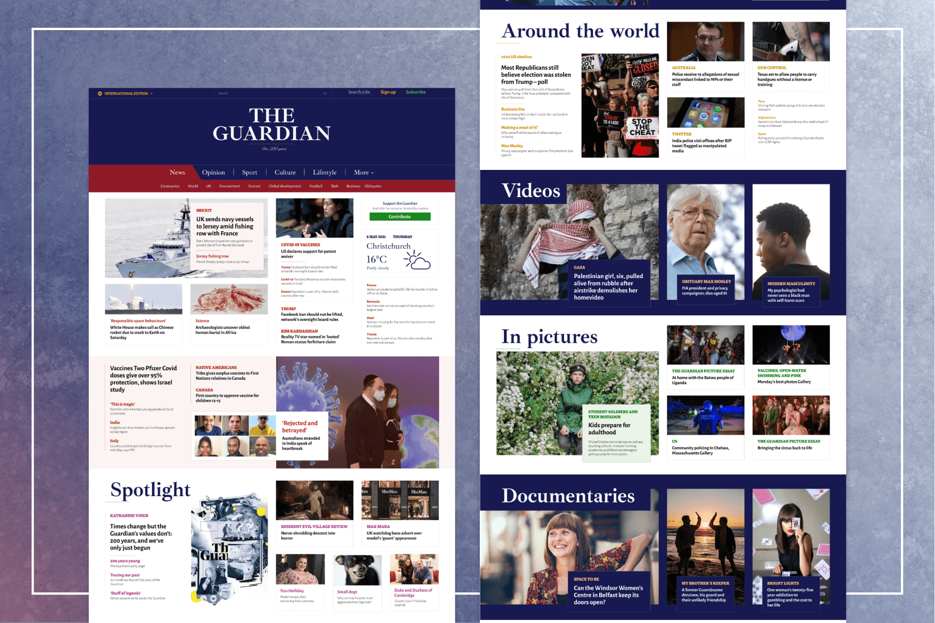
The Guardian is a well-known British news outlet, offering a wide range of content on global events, sports, business, and culture. I wanted to experiment with redesigning their website to make it simpler and more user-friendly, while still keeping the core identity of The Guardian intact.

Problem
The original site can feel a bit busy and overwhelming with all its content. In my redesign, I focused on creating a cleaner layout, adding more whitespace, and organizing the content into easy-to-follow sections, so users could find what they’re looking for without feeling lost.


Outcome
The redesign offers a much lighter and more inviting appearance. By introducing more whitespace, the content feels less crowded and is easier to digest. The typography was updated to create a more modern and readable feel, pairing The Guardian’s original font with a dynamic sans-serif to enhance the overall flow. I also adjusted the navigation to make it more intuitive, grouping related sections together for easier access. The overall design focuses on improving readability and simplifying the user experience, ensuring visitors can quickly find the latest news and enjoy smooth navigation without distractions.